

If you want to improve the effectiveness of your digital marketing strategy (not to mention the ROI), then conversion rate optimisation (CRO) is a must.
To help you get there, we’ve compiled a (really long!) list of 119 conversion optimisation best practices that can be combined with research to inform your testing plan.
This can significantly increase the chances of successful tests that result in a positive impact on performance, and therefore an increased return on your marketing investment.
We understand that sometimes, as a marketing manager, you might not be able to get approval to run a full conversion optimisation testing plan. Even if this is the case, you can still incorporate these conversion best practices into your regular digital marketing campaigns to help drive performance.
We’ve grouped the conversion optimisation best practices by category to make it easy for you to find the best practices applicable for your situation.:
Note: It’s best not to blindly copy these conversion best practices. Use them in conjunction with your own data as a starting point to help you hit the ground running.
Here are the categories, so review the best practices and hope you find them useful.

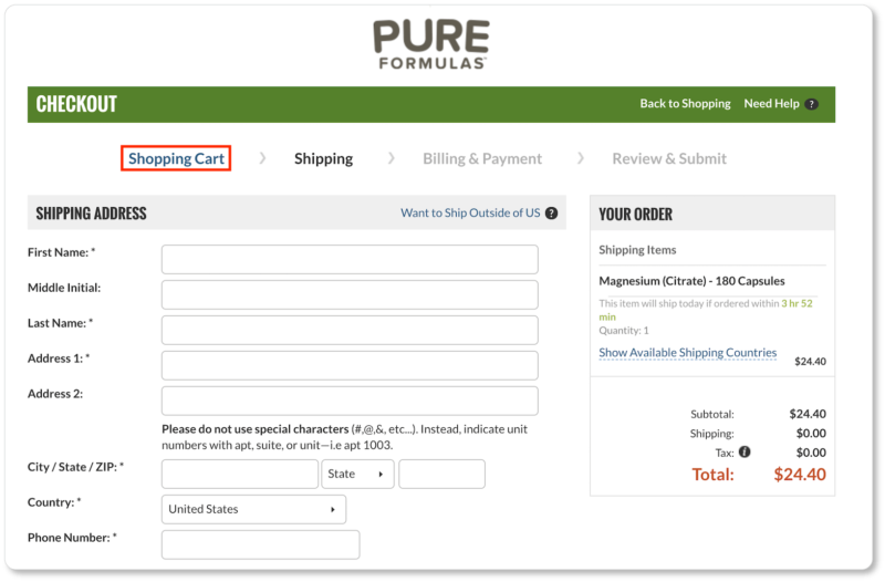
Web Forms

- Don’t ask for data you don’t absolutely need. Often (but not always), the more fields, the fewer people complete the form – this is due to increased friction. Match this with the expectation of the user though. “Applying for a detailed quote with only an email address field? Something doesn’t seem right, I’m not filling this in.”
- To improve lead quality, you might need to add fields to the form with the potential trade-off of fewer people completing the form. Test and review the data to see which yields the greatest return and give consideration to time spent disqualifying… or is there something else you can do with unqualified leads?
- Let people know what they can expect if they complete the form – they don’t want to fill out the form, they want what filling out the form gives them:
- First personal details, then shipping, then payment
- Complete the form and receive a quote within the hour
- Complete the form and access the download area instantly
- If you need a lot of fields in your form, break the form into multiple steps or group sections of fields together to break it up. It’s less intimidating and once people start something they are more likely to complete it. As an example, in a multi-step form, step 1 could be their personal details, step 2 their shipping address, and step 3 their credit card details.
- If your form is multi-step, include a progress bar to improve clarity and let people know how close to the end they are and how much time investment it might take.
- Have the least friction fields at the start of the form (name etc) and higher friction fields at the end (e.g. payment details). This is again to reduce friction to entice more people to start the form, meaning more people will follow through and complete it.
- If your form requires a significant time investment, allow them to save and complete later or even better, autosave. You might need to include an email autoresponder sequence to remind them to complete the form.
- Try and pre-populate as much of the form as possible
- Anything you already know about the user
- Address finder from postcode
- Auto-complete as they type
- Be very clear about communicating errors and clearly communicate specifically what the error is and how to fix it. Try to do this in real-time if possible.
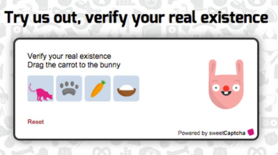
- Look into alternative anti-spam methods to the captcha as captchas can be ‘anti-human’ too. Here’s a user-friendly example of a captcha alternative:
- Include trust elements in your form to address fears and uncertainty to reduce friction
- Privacy Protected
- We’ll never share your information
- Card provider logos
- Antivirus logos
- Any other relevant assoociation or security logos that might increase a persons trust
- For mobile, have the field label above the field entry box to reduce form width and increase usability
- Avoid having form field labels inside the field entry box. They vanish as soon as the user starts typing and people can forget what the field is. Worse still, they have to second guess themselves and then delete what they just typed to reveal the field label again. They also can’t check their data before pressing submit.
- Clearly mark [optional] and *required field.
- Include help text if there is an unavoidable complex data request or if the user might question why you need this piece of data
- Doesn’t have to be visible and take up space, it can be a ? icon that they hover over or click to reveal the help text box
- Doesn’t have to be visible and take up space, it can be a ? icon that they hover over or click to reveal the help text box
- Let users know what clicking the button does. For example:
- Pay securely
- Get quote
- Proceed to checkout
- Get instant access
- Apply now
- Don’t be too strict with how they must enter data (meaning reduced errors and friction)
- 0404756483
- 0404756483
- 0404 756483
- 26/100 testing way
- Unit 26, 100 testing way
- Don’t hide passwords or at least have a reveal button. If people can’t see what they are typing, it increases friction and potential for error and more friction later if they mistyped their password.
- Increase the size of clickable things on mobile – buttons, fields (click to enter type mode in the field)
Watch this related video: How To Increase Enquiries Without Increasing Traffic (Video)

Buttons and Calls To Action
- Make sure the colour of the CTA button contrasts strongly with the background

- Make sure the CTA is big enough – you can probably make it bigger without it looking weird and it will probably entice more people to click on it
- Make sure the CTA button has enough space around it. This makes them stand out more, meaning more people likely to notice and click
- For each page, identify the primary action you want a user to take then make this action stand out against everything else so it’s very clear it’s the primary thing you want them to do
- The button copy can make a big difference in how many people click it. Some guidelines to have in mind when testing are:
- Specifically state what happens when they click the button. Example:
- Add to cart
- Proceed to checkout
- Download now
- Get a quote
- Include a benefit
- Save money now
- Improve your fitness today
- ‘Click Here’ often performs well so is worth testing
- Specifically state what happens when they click the button. Example:

Home Pages
- The goal of the home page is to communicate the value proposition (See point 60 in the copywriting section for value proposition) and any other relevant information. Then get them off the home page and deeper into the site through effective navigation (measure % of people moving from the home page to the next main page/s).
- Have a single, clear, main call to action. The primary thing you want them to do should be clear.
- Test long vs short home pages. There isn’t a right or wrong answer.
- Although today users are more than happy to scroll, still have the main elements above the fold. These are: Value proposition and call to action with a strong, clear, high quality image that helps to communicate the value proposition.
- People expect to see your logo in the top left corner and that if they click it, it will take them to the home page. Don’t disappoint them by trying to be clever with this.
- Keep the navigation simple and clearly worded. People are used to these elements and their naming convention on websites. Trying to be clever with navigation labels or design can easily cause confusion and reduce clarity meaning people give up and bounce to a competitor.

eCommerce: Home, Product/Service Category, Cart and Checkout Pages
eCommerce Home page
The objective of the home page of an eCommerce site is to get people off the home page and closer to consideration and conversion:
- Make sure the colour of the CTA button contrasts strongly with the background
eCommerce Category page
The goal of the category page is to help people sort products and find what they are looking for or a product that meets their requirements, then get them to that product page:
- Use filters to help people narrow down their choice of product and find what they are looking for quicker and easier
- Have the layout of the category page so the filters are in the left hand sidebar as this is what people are familiar with using. If you only have a couple filters, horizontally across the top might work better
- Let people sort products by logical means such as best selling, high and low price, highest rating etc as this further helps them to refine their search and choose a product
- Use badges on certain products to draw attention to these products (but use sparingly so the badges don’t become invisible)
- Discounted price or % off badge or ‘Hot Deal’
- Most popular
- Staff/Brand’s choice
- New
- Use high quality images. This seems common sense but there’s tons of low quality images on lots of ecommerce category pages so it needs mentioning. Make sure it’s high resolution, probably better on a pure white background.
- Also ensure the image shows the product in full. Even better if an alternative (example: rear shot of product or inside contents) or a lifestyle product image shows when they hover over it.
- Use big product images on ecommerce category pages. Reducing the number of products per row and increasing the image size could increase product desire and clicks to the product page.
- Include the price on the category pages. Don’t make them click through to each product page to see how much it costs. People know roughly how much they want to spend and this will just annoy them and cause friction and a poorer user experience.
- Use breadcrumbs to let people know where they are on the site and give them an easy route back. This should increase usability.
- Rarely do people buy on a category page so if you use calls to action on the category page, try not to use ‘Buy Now’ and instead test something like ‘View Details’.
- If you have parent and sub categories, allow the sub categories to appear in multiple parent categories IF it is logical to do so. This avoids the problem of users not being able to find a sub category where they expect to find it.
- Consider a ‘New’ category. This appeals to returning or regular visitors who are familiar with your store and want to see what new stock you might have in.
- Avoid trying to be clever with the naming of categories. This just causes confusion and uncertainty and will likely lead to less people navigating the category.
Watch this related video: 6 Concepts for Creating Landing Pages That Convert (Video)
eCommerce Cart page
When people add things to a cart, they are showing buyer intent. They are no longer a browser.
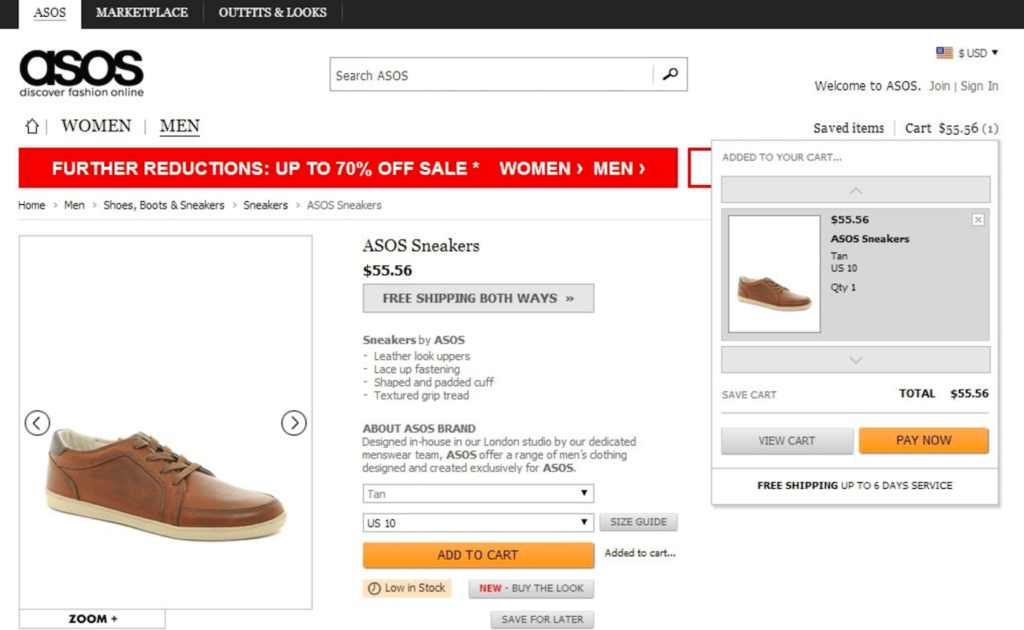
- Make it very clear that they have added something to their cart. Don’t leave them questioning whether the product was added to cart or not. Making it very obvious they added a product to their cart moves them a step closer to checkout.
- When they add to cart, you could redirect them to the cart page immediately or you could leave them where they are after showing them the item is in their cart. Test both as you are trying to find out if taking them straight to the cart will increase revenue vs leaving them to hopefully add more items to the cart.
- Test presenting them with upsells or related products on the cart page that they can easily add to cart with a click. It might increase the quantity and value of the cart.
- Make sure the cart page displays everything clearly, including thumbnail images and all costs such as shipping and tax. No surprise costs later usually means fewer people abandon carts.
- Let people make changes and update their cart easily. Allowing people to change the quantity of products, remove products or change the shipping options usually means fewer abandoned carts.
- The main call to action is proceed to checkout as this moves them closer to purchase, so make sure this stands out on the cart page as the number 1 action they should take.
- Try not to make the coupon field prominent. If they have one, they will find it. If they don’t have one and it’s prominent, they might leave to try and find one and many won’t come back meaning an increase in abandoned carts.
- Don’t let the contents of their cart expire. If they leave and return and the items they previously added are still in their cart, you might see an increase in completed orders.
- Display any assurance elements or reasons to proceed to checkout near the checkout button. Things like:
- Free shipping
- Fast, easy returns
- Multiple payments accepted
- Security/Privacy logos
eCommerce Checkout page
This is the page closest to the point of conversion, which means an immediate increase in revenue for any gains made here.
- Never make them create an account before you will let them buy something from you. This can be a conversion killer. Always have the option to checkout as a guest user. Alternative options for account creation could be:
- The option to create an account after they pay (with most fields pre-completed with the information they have already entered to checkout)
- The option to create an account and login using a platform like Facebook or Google
- Save asking for their card details until the end. It’s the highest friction item and if they have started filling out fields already, they are more likely to complete the card details fields when they get to it at the end.
- Add security elements
- Payment provider logos
- Padlock/SSL
- Any other relevant and applicable security logos
- Micro-copy like ‘secure payment’
- Making the design of these fields look like a credit card can increase familiarity and make people feel more comfortable and therefore more people complete payment details vs abandon.

Copywriting
- Copywriting has one main objective: To connect with the user and persuade them to take an action. Keep this distinction in mind when approaching copywriting.
- People buy things for emotional reasons and justify the decision with logic. Persuade them to make the decision using emotion but follow up with logic to help them justify the decision to convert.
- Help the person solve a problem or achieve a goal by capturing their attention, identifying the problem, presenting the solution, its value and why this solution is the best available for their needs. Close with a strong, benefit-driven call to action.

- For your main value proposition, a good approach is a headline, 1-3 sentence paragraph and about 3 bullet points.
- Headline: Capture attention and state the main end result or benefit that your brand, product or service offers.
- 1-3 sentences: Explain specifically what you offer, to who and why they should care
- Couple bullet points: Main benefits
- Keep a swipe file of all the good copywriting formulas and examples of great copy – headlines, product pages, ads, emails etc – so you can refer back to it for sources of inspiration
- Avoid superlatives as people don’t believe them and you could lose credibility or trust. ‘The leading/best.. X’ .. says who and how was this measured against other comparables on the market and when?
- Specificity converts so always be very specific. “Award winning software” vs “Winner of the G2 Crowd Global HR Software Award For Two Years Running”
- Everything is about them. Don’t focus on your company, products or services. Nobody cares. They only care about their problems and “What’s in it for them?”
- You usually want to reveal the price rather than hide it (although test this best practice)… BUT… communicate the value before showing them the price (including if the price is cheap – that’s also value)
- Improving the clarity in your copy usually performs well. Is it 100% clear what you are offering, what problem you are solving, the value and what you want them to do?
- Aim to answer all their fears, doubts, uncertainties and questions in the copy. This is usually more important than length. Don’t leave any gaps or it could negatively affect conversions.
- Make sure the font size is large enough, probably at least 16 for body copy. Larger font size generally goes hand in hand with improved engagement (up to a point).
- Copy online is not like reading a book. You need to break things up for maximum engagement. Use bullet lists, sub headlines, images and no more than 3-4 lines per paragraph.
- Let the subheadings tell the story. A best practice with subheadings is to assume people won’t read the copy underneath them. Aim for people to be able to get the main concept of the page and why they should take the desired action based on the headline and subheadings alone.
- For micro-copy (error messages, help text etc.), keep it as short as possible. Skip the pleasantries and dive immediately to the point you need to make. Space and attention are scarce with micro-copy.
- Focus on one main benefit or promise. Don’t try to talk to everyone about every benefit with your copy. Instead, test different one main benefit or promise against another one. Make sure the audience matches up of course.
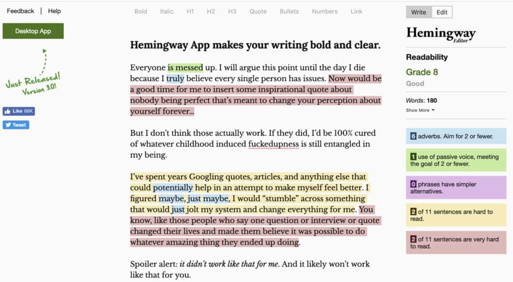
- A tool called Flesch-Kincaid scoring can be useful. The Hemmingway app is a good tool. It:
- Measures reading ease
- Sentence length
- Number syllables and other data
- Rates the entire piece
- The lower the score the more believable. Keep it simple, avoid jargon etc.
- <5.0 = very easy
- >10 = very difficult
- Newspapers = 5-10
- Copywriting = aim for <8 but ideally <5
- <5.0 = very easy
- Tell a story but make sure the prospect is the hero in the story, not your brand. Your brand is the guide in the story, helping the hero to overcome the challenges to achieve the desired end result. The moral of the story is to buy the product or service
- Know the difference between features, benefits and deeper benefits:
- Feature: what the product is/contains
- Benefit: What the product does/offers – what the user gets out of it
- Deeper: How the product can change the person’s life in some way or change a specific moment or experience in their life. Think about fluid and fixed moments in their life and how the benefit affects those moments. Keep asking “So what?” until you get to the deeper benefits.
- People don’t buy products and services, they buy transformation from the before state to the desired after state. Your copy should communicate this transformation (as a result of taking the desired action or buying the product or service).
- Including a ‘P.S’ at the end of your copy usually gets read. Use it to create urgency, state another benefit, add a bonus or guarantee or a combination of these things.
- Eliminate your first paragraph after writing it because it’s very common to get warmed up and waffle and you need to get straight to the point and tell them why they need to read the copy, what’s in it for them.
- Close the copy with a call to action, reminding them of the benefit and what they need to do next
- Use active voice and avoid passive voice. The Hemmingway app is a good tool to check readability and passive voice.
- This: Download the workout guide: “Top 10 personal trainers share their best workouts” to discover…
- NOT This: In this guide “Top 10 personal trainers share their best workouts” there’s information about…
- When you have written your copy, go back over it and delete every word that isn’t absolutely necessary. This will sharpen it up and better communicate the points you are trying to make.
- To improve your copywriting skills fast, choose a successful sales copy sample and copy it by hand word for word several time – maybe 10 times
- All the good habits will become second nature and will be imprinted on your brain making you think like a copywriter and cut the learning curve
- All the good habits will become second nature and will be imprinted on your brain making you think like a copywriter and cut the learning curve
- Get familiar with Robert Cialdini’s 6 Principles of Persuasion (explanation with visuals here)
- Reciprocity
- Commitment/Consistency
- Social Proof
- Authority
- Liking
- Scarcity
- Open loops in the copy to entice the reader to continue moving through the copy. People hate open loops and need closure. It’s a tactic TV shows often use to leave you hanging at the end of an episode and give you a glimpse of the next one to entice you to keep watching.

Pricing Pages
- The more complex or expensive your product, generally speaking the more information/copy, proof and trust you will need
- Instead of offering one price option, test offering 2 or 3. The psychology behind this is that instead of thinking “take it or leave it”, people think “Which one?”
- If you have a preferred option you want people to take, make sure the value stands out significantly against the other options – a ‘no brainer’
- If you don’t have a preferred option but still have multiple pricing tiers, make sure people can easily identify the value between each pricing tier
- Test the price itself to find the right price point, balancing the number of sales vs value of sale. You want the price point that generates the most profit in dollars.
- Mentioned in the copywriting section but mentioning again here. Test showing the prices or an indicative price (from $X) as people don’t like friction and hassle to get an idea of price.
- If your audience is multinational, let them choose the currency the price options are displayed in, or even better, detect which country they are from and automatically show the price in their native currency.
- Offer an incentive for a longer term commitment. You often see a discounted option for an annual payment vs a monthly payment.
- Include a clear call to action.
- Reduce friction and fear by offering things like a guarantee period, FAQs, testimonials, trust badges, well known logos such as ‘featured in’ known publications or existing [well known] client brand logos etc

Design
- Use visual hierarchy to communicate the order of importance of the elements on the page
- Use visual/directional cues to direct user’s attention to the elements on the page you want them to focus on (such as the call to action). Any visual cues that don’t point the user to a desired element are probably distracting from it.
- Elements that people use frequently on a page could probably be made bigger to improve usability
- Use big, bold images that follow the rule of the thirds where elements in the shot are lined up along the grid lines or at the intersection of these lines
- Users perceive elements in close proximity as a single object so only group things together that go together (like navigation) and make sure there is enough space between elements that you want the user to perceive as separate.
- The more elements we remove in place of whitespace, the more attention will be given to what remains
- Prioritise clarity in your design. Within seconds of a person landing on the page you need to answer the questions: “What is this page about?”, “Why should I care?”, “Where is the thing I want?”
- Generally speaking, keep the design simple and familiar to people and they are more likely to find the site more appealing
- People’s brains instinctively look for patterns and when they find one, they are more likely to not retain the information or lose interest. Breaking patterns maintains attention which is why you often see layouts on a page where they alternate image and copy left and right as you scroll.
- Be very very careful about making a decision to redesign the website. When you change the whole site, it’s very risky as things could be better, or they could be much worse in terms of conversions. Your returning visitors are also used to the existing design so there is a risk of confusing them and losing them. Before you start your redesign, identify the elements of your current site that are performing well and don’t mess with them much, just try and improve the visual appeal. Also try to identify the low performing areas of the current site or areas people have a problem with and incorporate these changes into the new design

- Avoid the email inbox purge by sending between the below times (people tend to purge the inbox with a low attention span when they wake up, at lunch and on their way home). Later on when you have data, you can test and adjust the send time to find the optimal performance. Best times to send as a starting point below:
- 8.30am to 10am
- 2.30pm to 3.30pm
- 8pm to midnight
- People are generally in a more positive mood in the morning before the day grinds them down so consider this with your email and social post content and send/post time.

- Personalisation in the email subject line can increase opens by up to 23% so test using their name.
- Email subject lines of about 6-10 words or 25 characters tend to result in good open rates, depending on the copy.
- Make sure you use the second email subject line as you have another 6-10 words to sell the open. Think curiosity, benefits etc.
- In the email body copy, an image with a play button (so it looks like they can play the video from within the email) tend to increase click through rate.
- To further entice the click using the above image and play button tactic, you could use a gif instead of an image to give a preview of the video.

Bonus Chapter: Ads
- Maintain ad scent between the ad and the landing page. Basically the ad sells the click and frames the page, so the page needs to maintain the scent of the ad visually, but also deliver on the promise made by the ad, the benefits and the ‘voice’.
- Make sure retargeting ads maintain the scent, especially if you are running ad sequencing.
- Opening your ad copy by posing a question to your target audience can often result in higher engagement. “Struggling to break 100kg on the bench press?”
- With ad creative, aim for the prospect to be able to ‘get’ the message from the creative alone without having to read the copy. The creative is the depiction of your message.
- For social ads, choose colours that contrast with the newsfeed to help capture attention and stop them from scrolling. https://coolors.co/ is one of many colour palette generator tools to help you choose colours that go together. Stay on brand too, of course.
- Use text in the image very sparingly for things like a call to action or the single big promise/idea. Use the caption area for the details
- Respect and align the temperature of the audience to the temperature of the offer. Example:
- Cold traffic who don’t know your brand = cold offer so as to introduce them to your brand. Examples: Blog and social posts
- Warm traffic who have engaged with your brand = warm offer asking them to take a small commitment. Examples: lead magnet offer or very low dollar investment offer.
- Hot traffic (ready to buy or previously bought) = hot offer to buy your main products and services.
Recommended Reading (also sources of inspiration for this post)
If you want to improve online revenue, accelerate growth and increase the ROI from your marketing budgets, we can help you with Conversion Rate Optimisation (CRO) services. Get in touch for a free proposal today.
Stay on top of the latest digital marketing news and trends by following us on LinkedIn, Facebook, YouTube or Twitter.