Transcript
Scott Pittman:
Hi, everyone. Welcome to another episode of Ask, Learn, Grow. The show where we sit down with The Reef Team to answer questions, share insights and discuss updates from the digital marketing industry.
I’m joined with Melanie Williams, one of the leadership team members here at Reef, and we’re going to be talking about call-to-action button copy.
Whenever you see conversations online about call-to-action buttons, no doubt at some point you’ll come across a joke – or in some cases a serious conversation – about testing the colour of the button.
“Change the colour to ‘red’ for an immediate 200% uplift”
I’m exaggerating but the point I’m trying to make is these sweeping statements aren’t very helpful and also don’t take account of your website and its visitors.
Is this really what CTA button testing is all about?
Melanie Williams:
Thanks, Scott. I have to admit that in my early days of optimisation, I was hearing this little joke about testing colours of CTA buttons, and it made me think that CTA button testing was something quite superficial and really just something that you diverted to when you didn’t have other tests to focus on.
That’s honestly how I viewed it for a while.
Small and simple as it may seem, conversion experts have actually proven time and time again that sometimes it’s those minor changes to the website, which can sometimes have a major impact on conversions. Call to action buttons are often one of those things.
Yes, you can certainly test button colours, but understand why.
It’s usually to make them stand out more from the background and capture attention. So green and orange are commonly good options…
Scott Pittman:
What if you’ve got an orange background or a green background?
Melanie Williams:
… Sorry?
Scott Pittman:
Green and orange. What if you have a green background or an orange background?
Melanie Williams:
Haha it just comes down to what colour your background is and what colour is going to stand out from it. You don’t want it to get lost in the background.
You want it to really stand out and catch their eyes. So if you have an orange background, don’t choose an orange button.
One important thing to remember though is make sure you have a lot of space around your CTA button so that it’s separated from the rest of the elements and copy.
You can also have a lot of fun testing buttons shapes and sizes. These things can all help your main call-to-action button stand out for your visitors…
But bear in mind that if your call-to-action copy is wrong, then these changes might not have too much of an impact.
Scott Pittman:
Yeah, dead right. What is good call-to-action copy? Where would you start with this? Can you shed any light on that?
Melanie Williams:
I’d love to have a formula where you could just say do this and the result will be fabulous copy, but really:
Creating high converting CTA button copy comes down to the context of the button; what type of CTA is it and what they get from taking the action
For example, you might think it’s a great idea to make your call-to-action button copy different to the action that you want your prospects to take (and we’ll explain why that’s a good thing in just a moment)…
But in certain situations – say with an Add To Cart button – departing too far from what user’s expectations are can actually have a negative effect and cause confusion.
I had a client once who made and sold bespoke, handmade products online.
Rather than running with the standard ‘Add To Cart’, they went with: ‘Make My Product’ for the button copy.
The client found that while they were having lots of traffic to their product pages, people were not adding things to their cart.
So we conducted an exit survey with the site visitors, asking them why they weren’t adding products to their cart, and we found that visitors were really confused by the call-to-action button copy.
People are very conditioned to adding things to their cart and seeing the same button copy on almost every eCommerce site that they visit.
This has created a very strong expectation in most people’s minds. To find the ability to add to cart, almost without thinking. They have extremely high confidence about what will happen if they take this action and click ‘Add to Cart’.
They also believe that by adding something to their cart, that they have time to change their mind if they want to and are not committing to the purchase.
However… ‘Make My Product’ button copy implied that by clicking it, they were actually committing to a purchase when they were not quite ready to do so.
So in this situation, it actually had a negative impact.
We changed it back to the simple ‘Add To Cart’ and saw an immediate uplift of 17%.
In most situations, call-to-action button copy that states the action that you want the user to take, isn’t the most effective.
This is what we’re going to be looking at next.
If there was any type of formula that could be applied to the majority of CTA button copy situations, then it would be this formula that’s provided by CXL, which is:
Value + Relevance = Conversion
By value, it means that the prospect needs to have a motivation for clicking your button and by relevance, it’s what the prospect will receive when they click that button.
Scott Pittman:
I like the example that you gave with the Add To Cart button.
Just to circle back round to this before we move on… the thing with commitment, with certain call-to-action buttons, like you said, the user is very familiar with what they’re doing. They expect it.
It’s the law of familiarity.
Add To Cart is a very, very, very low commitment.
“Oh, Add To Cart. I’m not actually buying or signing up to anything.”
But it’s the next step in the Customer Conversion Journey.
“Make My Product”… Ooh, not quite ready for that yet.
It’s asking too much too soon.
So that makes complete sense to me and it was proven that this was the case as well with the 17% uplift.
Okay, cool. Have you got any examples that we might be able to look at as we discuss the other type of call-to-action button copy?
Melanie Williams:
Yeah. A classic example would probably be the call-to-action button at the bottom of a form-fill.
Here, you want the prospect to submit a form so that you capture them as a lead.
You’ve probably prepared a landing page with details on what they receive when they fill out the form (your offer) and what benefit(s) your offer provides them with.
You might have even optimised the form to make it simple and easy for them to complete.
… but then you add a button at the end of the form that says ‘Submit’.
It seems logical, right?
But it’s a wasted opportunity and if we apply the principle from CXL, that value + relevance = conversion:
The problem with having ‘Submit’ as your call-to-action button copy, is that it tells the prospect what to do and not what they’re going to get.
It’s missing that major opportunity of reinforcing the value that they’re going to receive by completing the action.
So yes, you’ll probably get a few people actually submitting the form and pressing the Submit Form button… but how many more conversions could you generate by tweaking the call to action button copy to something they will get vs something they have to do?
Scott Pittman:
Who wants to submit a form?
Not many people want to submit a form, but Get Your [Desired Thing]… that’s what I want. I don’t want to submit a form, but I do want the outcome from submitting the form.
Melanie Williams:
Absolutely.
I have a really great example here from PetAmberAlert.com which reinforces CTA button copy best practice
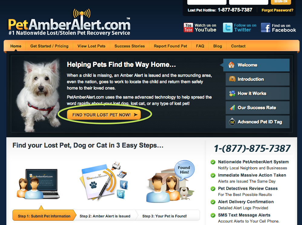
Scott Pittman:
Okay, cool. So we’re looking at PetAmberAlert.com and what looks like a really good CTA button copy.
Do you want to talk us through it?
Melanie Williams:
Yeah. This is a great example of a CTA button that ticks a lot of boxes.
They could have chosen a generic button that said: Start Your Search (or similar), which would have been ‘acceptable’, but instead, they chose CTA button copy that’s highly relevant, emotional and speaks to the desired end result.
‘Find Your Lost Pet Now’
So you’re getting value and you’re getting relevance very clearly communicated and linked to taking that specific action.
Remember, the key is to convey what your prospect will be getting from taking the action and making the CTA button copy extremely relevant to their specific situation.
So in most instances you would avoid things that are telling prospects what to do. Things such as order or send, submit, or download.
Instead, you try to use specific, first person action words like ‘Get My [Free] Thing’ or ‘Reserve My Seat’.
Scott Pittman:
It speaks to the desired end result and in this particular example, it’s quite an emotional one as well.
I think I’d probably like to test a couple things.
Just looking at it on face value, the button is a similar size to the navigation and it’s the same colour.
So I’d probably like to run a test if this was my site, with a larger button and make it stand out more and see if more people click it.
I’d make it more prominent and visual on the page, because it’s the same colour as the navigation and the same size.
I think if we could make it bigger and more prominent and contrasting, we might see an uplift.
So there’s a rule, isn’t there?
It’s called the two year old test or something like that.
So if you get a child and tell them to point at the screen at the most important thing, they should be able to pick out the main action you want people to take, due to it standing out on the screen.
Another one is you can stand 10 paces back from the screen (an average size screen), and it should be quite clear what the main action is.
So I’d probably look at doing that for this page, but other than that, the call-to-action copy is really good.
Melanie Williams:
It’s fabulous. Chances are you’re not going to find the perfect CTA copy and the perfect colour and the perfect placement from outset. This is why you need to make sure that you’re always testing.
It’s essential for finding out what copy is going to perform the best and what colours, placements and many other elements will work for your particular website and audience.
Scott Pittman:
Okay, great. Thanks for going through this Mel. Just before we close up the call, any final thoughts? Anything else to add?
Melanie Williams:
I think just remember that you might think it’s such a minor thing in the scale of conversion optimisation, to be fiddling with button copy.
But just remember it’s usually the last chance that you have to convince a prospect to take the action that you want them to take. So in actual fact, it can have a significant effect on your conversions and therefore revenue if you get it right.
Scott Pittman:
That wraps up today’s call.
So if you’ve got any questions about this topic or any digital marketing related question, send them in and we’re always happy to help.
If you’d like to put a burning question or problem to the team, please send those in too and we’ll see what we can do.
Don’t forget to subscribe to the channel to be notified of when the next video is available. Apart from that, thanks all for watching and enjoy the rest of the day.