
One of my biggest gripes with online marketing is poor customer experience. Too many brands, big and small, still fail to deliver pleasurable experiences to visitors despite pouring hundreds of millions of dollars into advertising to attract visitors. In fact, research from Google points out that users form their first opinions about a website in just 50 milliseconds, and in some cases it’s as low as 17 milliseconds.
While user experience has, in recent years, become a standard practice in planning web development projects, most websites still fail to provide visitors with a truly memorable customer experience.
My father spent his entire career with a major British retailer and has one or two war stories about opening new stores. I mention this because I know retailers have spent decades perfecting elements of store layouts, from fittings and POS material to carpets and shopfront impact. Getting details like this right has significant impact on business performance – because this experience is part of the product. Think of a luxury car showroom or a nice restaurant. Without customer experience being considered in the design, they’re just boring rooms that sell cars or food.
So, if websites are the new shopfront, why shouldn’t this approach apply online, too?
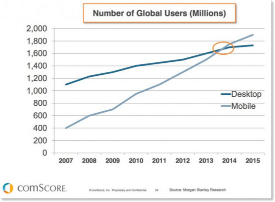
Surely businesses should be treating their websites more like a product, implementing thoughtful design practices to deliver pleasurable experiences to visitors. It still astounds me that in 2016, designing for mobile is an afterthought or a nice to have. Check out the ComScore graph above if you’re not convinced. We should be wireframing mobile before desktop!
In Jay Bear’s excellent ‘YouTility’ (thoroughly recommended for all marketing folk) you’ll find a great quote:
“Stop trying to be amazing and start being useful.”
Now, this could of course apply to many areas of marketing (the original context is in relation to content), but when it comes to customer experience, the poignancy couldn’t be greater.
If you’re interested in exploring the concept of product thinking in the regard of web design I suggest you check out David Hobb’s post on Medium, ‘Manage your website like a product’ from a couple of years ago.
What is customer experience vs user experience?
Before we dive into some examples it’s important to establish the difference between customer experience (CX) and user experience (UX).
In my view both are fundamental to the success of brands online (and off), particularly in the e-commerce sector, but also more broadly as the principles can – and should – be applied to almost any web presence that seeks to serve, and moreover win, customers.
Customer Experience
Kerry Bodine (former VP & Principal Analyst, Customer Experience, Forrester Research) is far more qualified to give you a full explanation of the difference and how it’s all applied in this video.

Briefly, customer experience (CX) is the art of designing the overall user journey to influence, as per the screenshot from Kerry’s presentation; ‘How customers perceive their interactions with your company’. This can include everything from the very first touch point (a piece of digital content, direct mail flyer or cold call) through to an initial interaction (telephone call, social media conversation or in-store visit), sales experience, delivery of the product or service, customer service/after-sales care and beyond.
User Experience
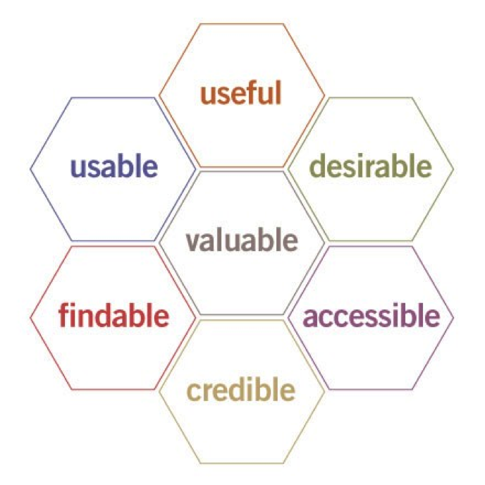
Check out the UX honeycomb by Peter Morville to understand more about UX.
User experience is a component of CX; ensuring optimum experience of a product from the perspective of a user. In the world of digital marketing this means influencing website/app/digital asset design to assist and encourage visitors to engage in a preferred manner, typically with a commercial focus.
Thinking further about UX, here are some questions a visitor might ask when visiting your website:
- Am I on the right website?
- Is this consistent with what I was expecting to see? In other words, did the advert I just clicked on align what I’m looking at now?
- How easy is it to complete your contact form?
- How long does it take me to search for the products I’m most interested in?
- Can I find all the information I need to immediately?
- How many more vague value propositions do I have to read before I understand what you do?
- How do I just speak to someone?
- Why don’t you have any prices?
- What do I need to do next? I just want to order a product?
- What do you mean I’ve got to fill in all those form fields!?
- Why does your website not work properly on my smart phone? (No seriously, why…? Actually forget it, I’m on a competitor’s site now anyway)
Now ask yourself, how many of these are you confident about when it comes to UX? In fact, why not go try the above your own website right now? Then give it a go on your competitor sites. The outcomes might surprise you.
Thinking about your website as a product
By considering your website as a product in itself – rather than somewhere you can sell ‘at’ people – it’s only logical that the response will be positive. Take a moment and think about the last time you went to a website and found it truly enticing.
Apple
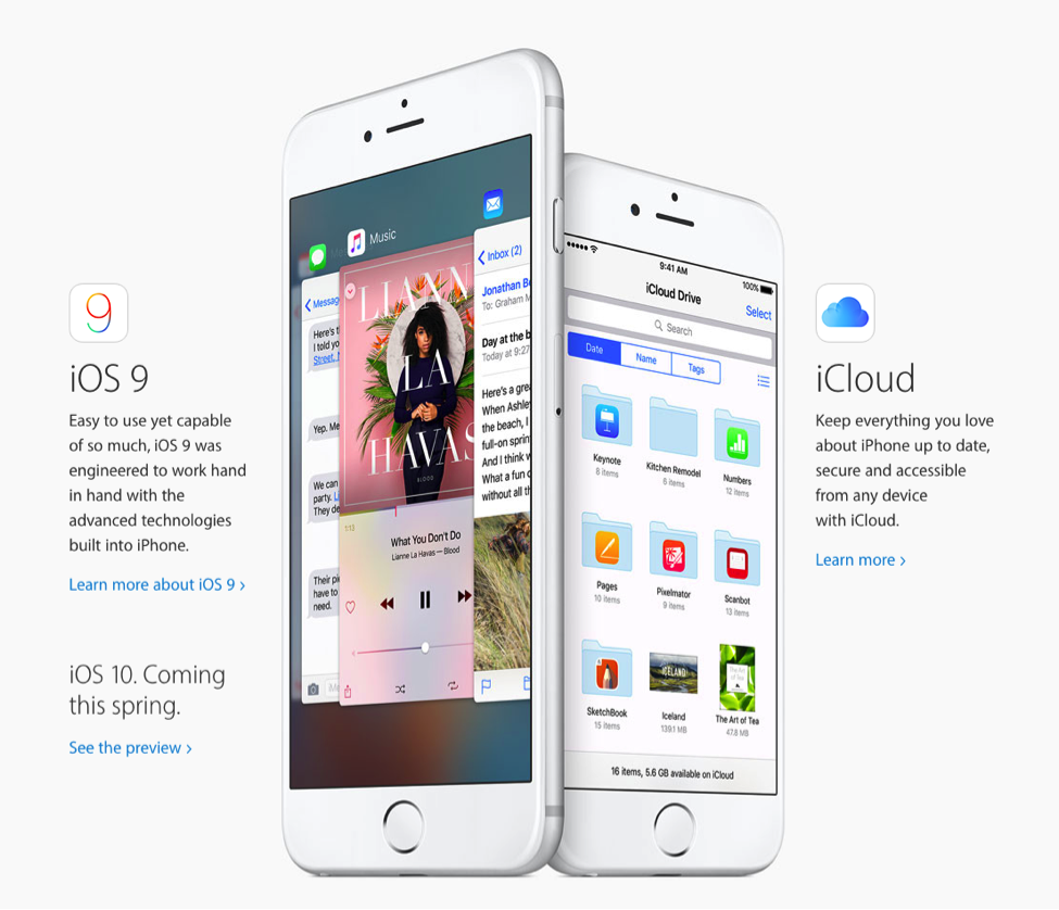
I normally avoid Apple references at all costs when talking about marketing (the story, concept and relevancy of the brand is at such a scale it is entirely foreign to most other businesses). However, I will, for the purposes of this post, make an exception. Go open a new tab and jump into an Apple product page, any will do. Take in the white space, the flowing content, the beautiful imagery, the story-telling copy, the subtle call-to-actions. It’s easy to scan and commands the attention of visitors. What makes this all feel so good (apart from benefiting from a massive budget) is that it’s consistent. Simply using the website feels like using an Apple product. That consistency is key to delivering the overall premium, minimalist, design-centric experience – a luxury brand for the mass market.
JB Hi-Fi
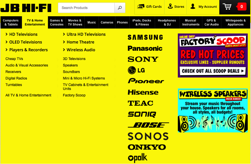
Now, consider JB Hi-Fi. A stark contrast in product of course. However, it’s immediately clear that visitors should expect low prices on everything from dishwashers to headphones. Okay, so maybe nothing special about selling cheap, but go to any JB Hi-Fi store and count the number of handwritten discount signs, sale stickers and special offers decorating the environment. Customers are bombarded with the same message, repeatedly, which is, “you will save money”. The web experience is not dissimilar. The consistency of the experience is as strong as Apple’s – and this makes it really easy for consumers to understand the value proposition. As far as design goes, the site is easy to navigate, finding major brands or popular products is quick and the checkout process is simple. This makes the JB Hi-Fi website really useful to visitors:
- Visitors know what to expect
- When they land on the website, design is consistent with their expectations (red and yellow sale stickers, handwritten-style offers, etc.)
- Returning visitors experience consistent messaging and branding (yellow/black)
- Finding the product they’re most interested is quick and easy
- Checking out is a clean three-step process
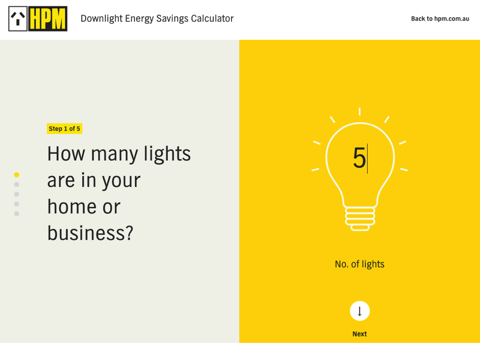
HPM
Here’s something totally different again from HPM, a subsidiary brand of major French electronics manufacturer Legrand. In this example HPM have built a handy calculator on their website to help people work out the cost savings of switching to energy saving downlights. Rather than a dull web form, visitors are greeted with a beautifully designed five step scrolling process with delicate animations. The guiding nature of the calculator is smooth and the clean layout encourages completion of the questions thanks to plenty of whitespace and minimal distractions. Interestingly, there’s no product photos here, no direct, salesy call to action, just a useful link to the product selected in one of the steps. It’s really refreshing to see something that is both genuinely useful and well designed – particularly in an industry like this.
How brands win online with UX that goes the extra mile
Brands that are winning online are doing so because they are delivering truly memorable experiences to visitors.
Here’s a look at a few ways brands are delivering great user experiences that are relevant, useful and engaging. While cost can be a big barrier, particularly to those with lower budgets, the concept of many of these examples is actually relatively simple. Chances are, you could probably develop something for your website without breaking the bank – so long as the idea is a good one. One of the biggest barriers to this is understanding your real audience. If you’re not sure how to do that, I suggest you take a look at this.
Consider whether any of the suggestions below might be useful for your audience. Got a better idea? Drop me a line @mattdove on Twitter or let me know in the comments section!
1. Highly relevant content
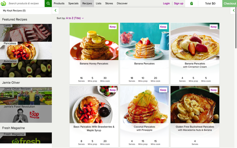
I know this is a pretty obvious choice – and that not all brands can rope in big celebrities like Chef Jamie – but it’s a really clear illustration of delivering highly relevant content to your audience. Ever Googled a recipe before heading to the shops? Or even while you were mid-aisle? Not only is this relevant and useful, it can also be great for SEO – if it’s done correctly.
2. Tools and calculators
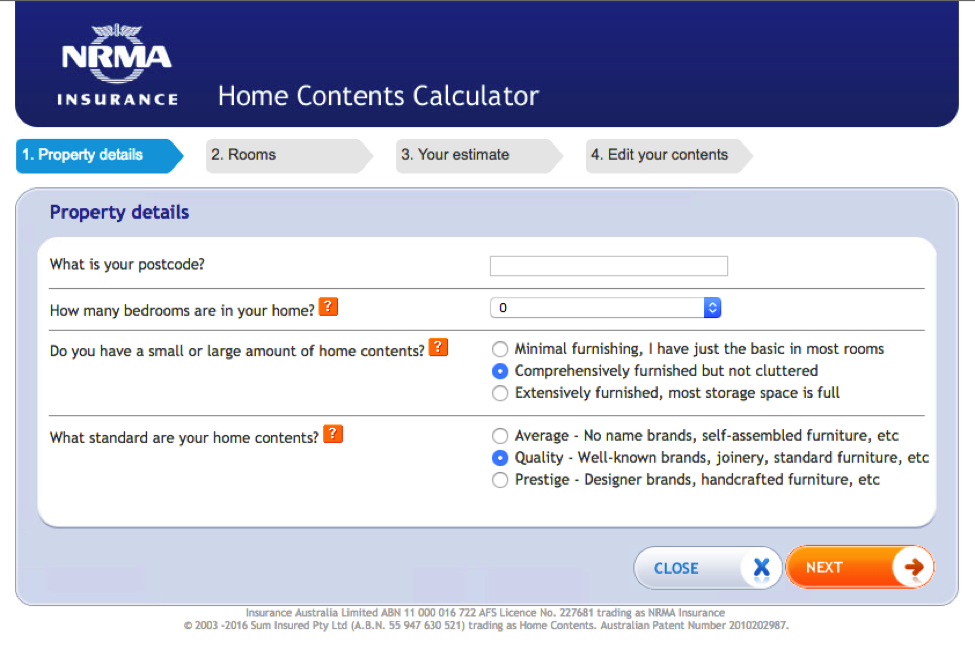
In addition to the great example from HPM earlier on, here’s another; an insurance calculator from NRMA. You’ve no doubt seen similar tools before.
I think the execution could probably be improved, but the fact visitors can create their own quotes is excellent. It enhances the user experience by being both useful and relevant and supports the whole customer experience by making life that little bit easier.
3. Social media integrations
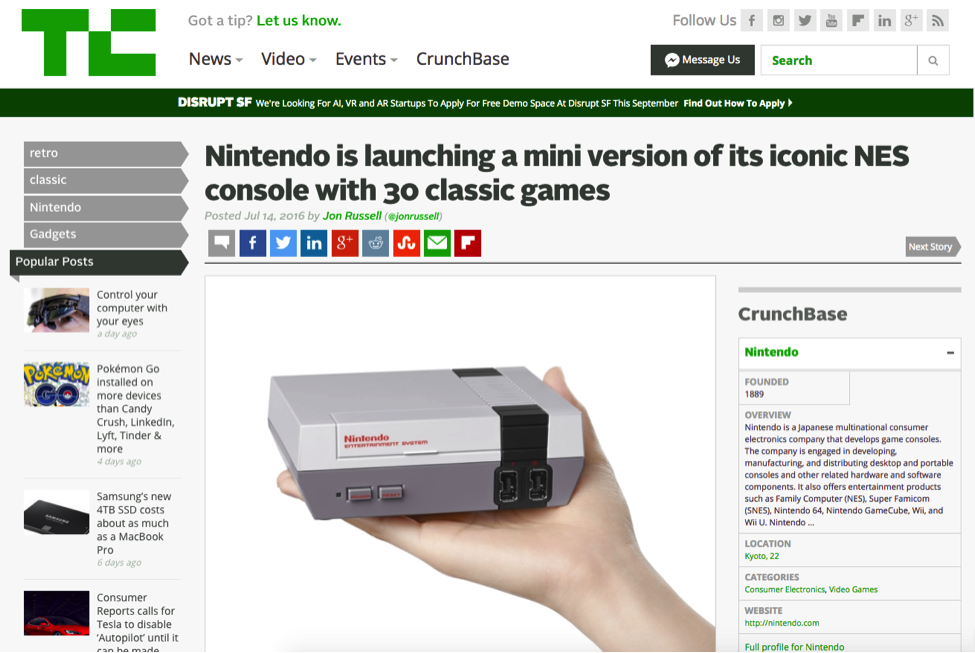
Social media integration is great for a number of reasons, not least to make it easy for people to share your content and help grow your audience. Technology and Silicon Valley commentator blog, TechCrunch, goes one step further and serve us the Facebook Comments plugin to allow visitors to use their Facebook account to comment on posts. This makes it easy for users to engage – most people stay logged in when not using Facebook – which means there’s no need to remember another password or login to comment when something really excites you.
4. Forums and brand communities
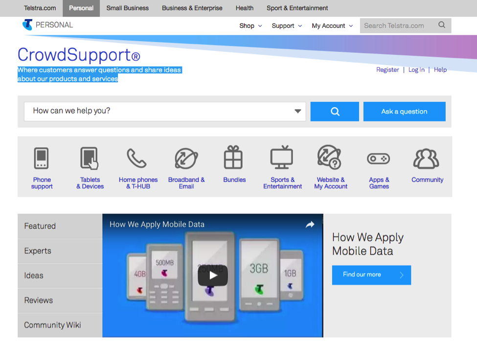
Lots of brands now have product discussion forums and even social platforms to allow both customers and non-customers to connect with each other. Telstra has developed CrowdSupport; an online community “where customers answer questions and share ideas about products and services.”
This is a great way to reflect how much you value customer voice while allowing fans of your brand to play a key role. This builds trust and means Telstra get a helping hand with customer support queries. CRM platform, Salesforce, offers a similar community experience.
5. Gamifcation
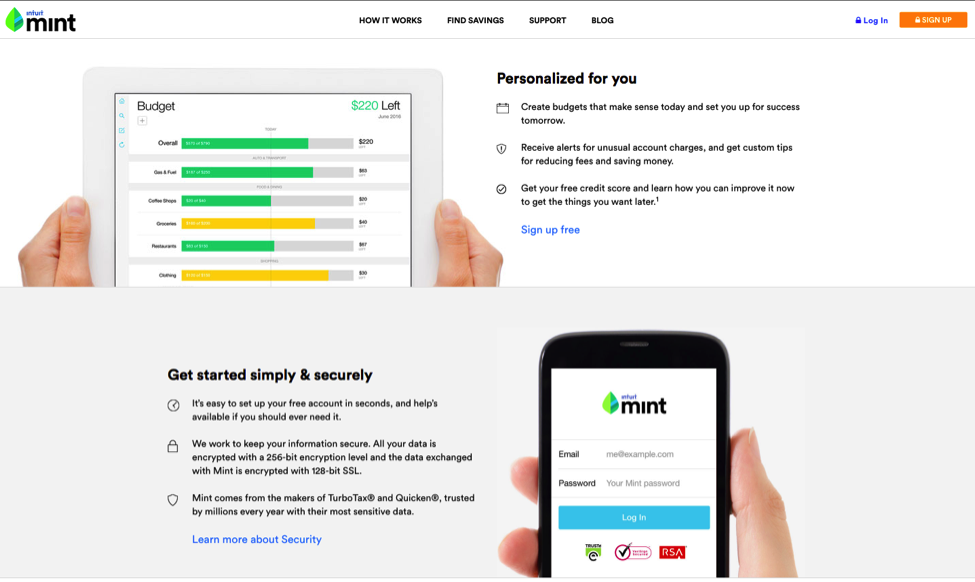
One awesome example of gamification is SnapChat. You get rewards for using more of the features of the app which encourages users to explore the functionality and learn the interface. Another great example from the US is Mint.com, a consumer money management platform that helps everyday people manage their money better. Users enjoy snazzy graphics and a cool app
to help do get on track with their personal finances. Pretty cool.
6. Product configurators
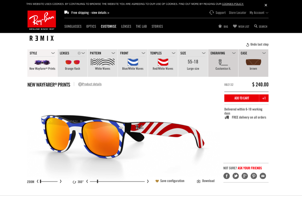
Automotive brands have used product configurators for years. Not only is it super fun to spec out your dream ride, it’s actually pretty useful for prospective customers to work out what’s most important to them. This means visitors to the site can become more informed about the product and ensure that when they step foot in a showroom, they won’t have any silly ideas around price. However, for the purposes of this post, I’m going to point you in the direction of Ray-Ban sunglasses. Their product configurator is a ton of fun – check out my sweet design above. There’s a touch of Randy Savage about them, right? Perhaps they’ll just stay in the shopping basket.
Where to start
There’s plenty to consider when it comes to UX and CX. Bear in mind that you don’t have to do everything all at once – just don’t fall into the trap of letting your website become stale. The fact is, you have to stand out from the crowd. Delivering a great user experience will help you do that and as a result, win more sales, clients or customers.
Here are a few ideas, based on what we’ve looked at in this article, to get you going:
- Make sure you factor user experience into your web design
- Take a look at your CX and work out how UX fits in; how can you make the two align?
- Keep it relevant, easy to use and keep your target audience in mind at all times
- Be consistent with messaging on and off line – meet (and exceed) user expectations!
- Reach out to your existing customers and ask for some feedback on your existing website, what they would like to see, what they do and don’t like about.
- Contact forms are normally one of the most important yet poorly designed parts of website. For more details on how awesome forms should look, check out this great post from UXdesign.cc on how to design forms better. The same goes for call to action buttons and other features.
- Explore options for enhancing the user experience in line with the customer experience, like the examples above.
- Ensure your blog has content that helps, informs or entertains your target audience
- Keep trying to improve and seek out new ways to make your website stand out from the competition!
Got any more ideas? Great! Join the discussion by letting us know in the comments below.